08 May, 2010
07 May, 2010
Final Design - MACHINE Double Page Spread
 The above image is my final double-page spread design for my MACHINE magazine that focuses on the genre of metal. I took design inspiration from my previous analysis' of double-page spreads from the existing magazine industry.
Bibliography:
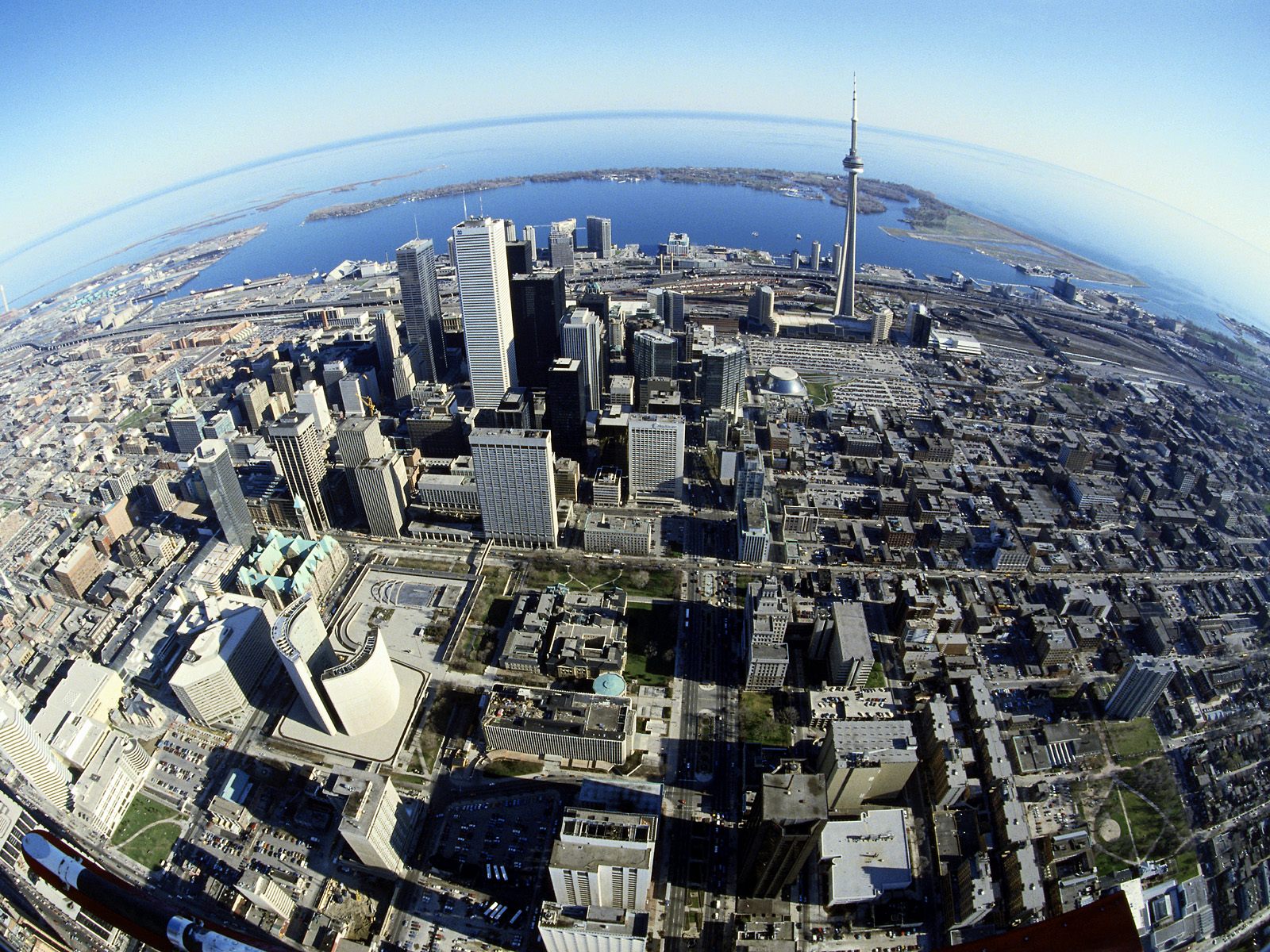
City Scene
 The above image is a screenshot taken from within Photoshop CS2 - the software package I utilised in order to produce the work. As you can see, I have made as much 'behind the scenes' material visible as possible.
Final Design - MACHINE Contents Page
 The above image is my final contents page design for my MACHINE magazine that focuses on the genre of metal. I took design inspiration from my previous analysis' of contents pages from the existing magazine industry.
 The above image is a screenshot taken from within Photoshop CS2 - the software package I utilised in order to produce the work. As you can see, I have made as much 'behind the scenes' material visible as possible.
 Final Design - MACHINE Front Cover
 The above image is my final front cover design for my MACHINE magazine that focuses on the genre of metal. I decided to include such bold elements as the Future Publishing logo and slogan "The United Kingdom's Best Selling Metal Magazine" to make the overall production feel much more 'real', and also to further display how typical mainstream magazines use wordplay to grab the attention of their target audience.
I used valuable information gained from analysing front covers from Metal Hammer and Kerrang! magazines to accurately gauge what my target audience is looking for when it comes to aesthetic and language qualities within the realm of magazine publishing.
Other than Soulfly and In Flames, I created all of the band titles myself; this was not only a creative process that was fun to engage in but a hyperbolic play on what I believe to be typical metal band names that get churned out of the music industry. I let the photograph of choice (of which I took myself) dictate the colour scheme - which is evidently shades of red, brown, black and white. I manipulated the stock image of the cityscape to follow the scheme, likewise.
One minor change to be noted is the shortening of the magazine name; instead of "The Machine" I decided to make it as minimalist as possible. This not only gives me as a designer more room to fill one word in with, but as a reader it will much more memorable due to it's decisiveness.
Bibliography:
City scene (background)
Future Publishing logo
Barcode image
Image of Tickets
The above list details the source location of images I manipulated in order to achieve the final design; as is evident I moved as far away as possible from relying on stock images - not created by myself - to serve as the focal point of the design, and therefore made the cover 'my own' creation.
 The above image is a screenshot taken from within Photoshop CS2 - the software package I utilised in order to produce the work. As you can see, I have expanded the Layers tab to show as much 'behind the scenes' material as possible; noting the speciality language regarding magazine design such as "Masthead", "Banner" and "Headline".
Band Photography - Soilborne at the Abbey Cathedral


 Note: I uploaded the above photographs to my Photobucket account, as due to the large file size the process would be a lot quicker than waiting for Blogger to upload it straight from my PC.
04 May, 2010
Magazine Analysis - 'Metal Hammer' Double Page Spread
 The above image is my first double page spread analysis taken from Metal Hammer. Clicking the thumbnail will enlarge the image.
10 March, 2010
Design - Magazine Logo Ideas
 These are just some of the magazine name and logo designs that I have roughly created. Before I activate a poll for the general public to choose their favourite, I will be making more varied designs to make sure I have exhausted all angles of design to do with magazines covering the genre of metal. The following is a very brief explanation of each of the above four logo designs:
- #4 is my personal favourite out of the four, although the font might not the best for the job.
- #3 was inspired by Q magazine, and it would likewise be placed on the top left corner on each edition - possibly changing the rust effect to whatever suits the main photo each week.
- #2 looks a bit of a mess, but leaves a lot of room to comfortably fit sub-titles between the letters that stick out.
- #1 was inspired by the Total Guitar and Classic Rock magazine, so the chosen font might be way off, but the placement and 3D effect of the two words is more what I was experimenting with.
09 March, 2010
Research - Magforum.com
http://www.magforum.com/index.htm
The above link will direct you to a website dedicated to all things magazine; from guidelines to creating a front cover to a detailed history of the media form that is magazines. I will be frequently using this source of information during the production stages of my front cover, contents page, and double-page spread.
Subscribe to:
Posts (Atom)

